Rapture Board Game

1468699_641308462585754_823810595_n

One of our modules in second year was Generic Production. With the freedom to independently create our entire brief for the year we were required to work in groups, and were graded on each of our presentations to a small collective of lecturers. The first presentation was pitching our individual ideas to the whole class, the second was once we had formed groups with the other students we wanted to work with or ideas we liked we had to further develop the idea and present the newly modified brief. We then had the rest of the year to produce our product, with a final presentation at the end of the year.

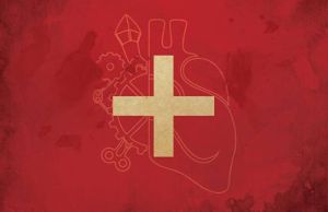
I worked with four other Graphic Design students and we created a board game. Originally inspired by the likes of the console game Grand Theft Auto with it’s missions and open world, and monopoly, giving players the opportunity to buy and sell whilst moving around the board.

20140508_102349

We decided that the genre of Steampunk would be a brilliant style making the board game unique. Steampunk is becoming more and more popular but is still relatively unknown when considering mainstream popular culture. Whilst there are Steampunk board games that exist, they are aimed at a smaller market place, and we wanted a game that could be enjoyed by a bigger audience. Steampunk gave us a great platform to get inspiration, and develop ideas for characters, areas, missions and artwork.

10247463_653430538040213_7573160667683748514_n

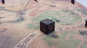
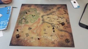
The gameplay has a relatively simple objective; to survive. Unlike Monopoly where money is what defines the players status, it is health that is the driving force in Rapture. In this steampunk world that we created, Health can be bought, sold and traded gained or lost in missions, and is represented by Health Cards of different values, much like a currency. Once a character has lost all of their health, they are essentially dead and out of the game. As the player moves around the board there are five areas that make up the map of Rapture Island, each with their own unique Area cards to land on.

1614099_659165144133419_6002820423264751658_o

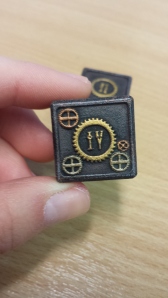
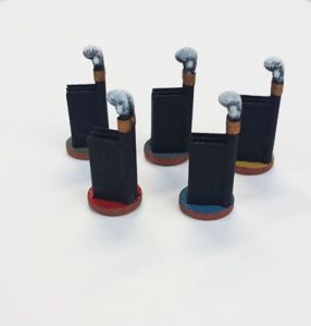
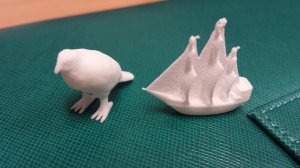
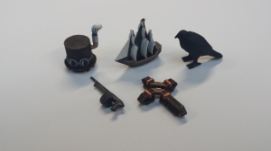
As we had been newly introduced to 3D printing technology we had our dice, safe houses and character counters printed and hand painted. This gave the game a much more personal and higher quality feel to it, especially the dice, rather than the standard black and white ones.

20140508_104308

20140304_093712


Here are some images of the Safe Houses and Character Counters:

10246615_653876787995588_3768120465963889776_n

20140422_121755

Straight from the 3D printers

20140425_153358

All five after being hand painted

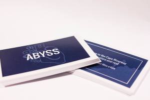
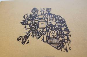
We obtained some “leather” textured brown paper, and one of the other group members skillfully covered a box and hand drew a variation of the logo on the front.

10317729_659728360743764_701184450043608763_o

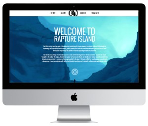
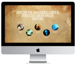
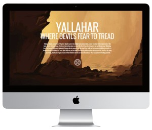
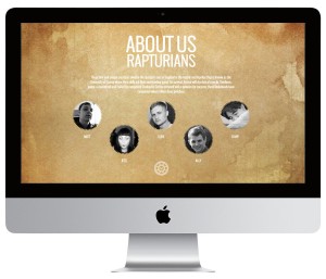
Because this project has the potential to sell and is essentially ‘shelf ready’, we wanted to consider marketing. One member of the team is a very skilled web designer so one of his jobs was to create a site for Rapture. It has information on the game itself, a small section about our team that created it, and links to our Raptures socials.

site1

site2

site3

site4

Please visit www.raptureisland.co.uk to see it for yourself!

We also managed to get over 80 likes on Facebook and 35 likes on Twitter!

This was a really fun project, and it has given me hope in group work again! I’m happy to have experienced first hand how amazing and fun a group project can be when everyone is equally as motivated and pulls their weight. I have been told my individual grade for this module, but I won’t post it yet, as the Board of Studies was only last week, and the external verifiers can either move the grades up or down if they don’t think we were graded properly by the lecturers. We collect our grades on the 10th of July, so fingers crossed it either remains the same or goes up!
Making Books

It’s coming to the end of the final year of the Foundation Degree course that I am on. The majority of projects have been handed in with the exception of Animation and Film Production which are due on the 2nd and 3rd of June. Today I submitted my Industrial Placement, and Graphic Design assignments.

Graphic Design is one of the subjects that I enjoy the most and am stronger at. This year both first and second semesters projects have been produced in a professionally printed book, which I found to be one of the more exciting parts! I love books anyway, but to see my own hard work presented well in a book, is one of the best, satisfying feelings. I used Blurb to print my books and they always do such a great job, that once I find a good subject matter and decent content I will definitely consider creating more books.

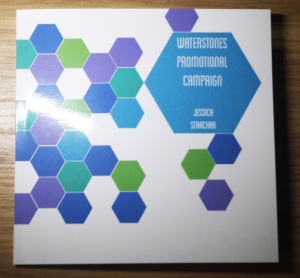
Here is second semester’s Graphic Design book. A post on first semesters book can be found here.

book2


book3


book4


book5

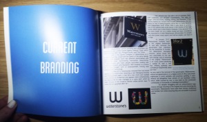
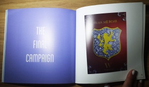
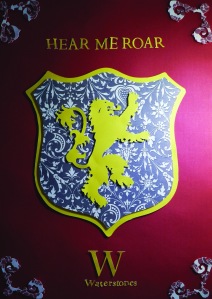
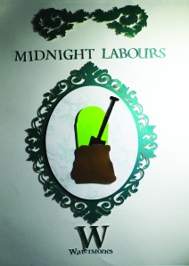
The brief was to create a marketing campaign for Waterstones. I chose to use the method of cut paper, with a post-modernist theory on making the audience guess the subject of each poster design. Encouraging them to guess what book each image and quote comes from.

ASOIAF

frankensteinfinal


Pick Me Up 2014

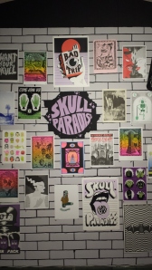
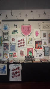
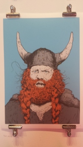
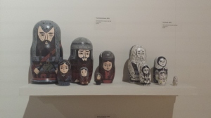
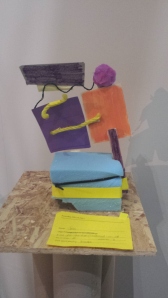
After visiting Pick Me Up at London’s Somerset House for the last time on Saturday, I thought it appropriate to post about all the amazing illustrations and stands I saw there, and what I took part in. 

Skull Paradise

Skull Paradise

20140429_111034

Puck Collective

Jessica Das


On tuesday 29th, I went to Pick Me Up with the other students on my course and my lecturers. The main feature of the day was ‘Grid Forms’ with illustrator and designer Melvin Galapon, and choreographers, Marquez & Zangs. It was an interactive game that required a team of five. Each person had to do a pose that a shape represented in the correct square that was marked out on the floor. As time went on the positions were shown faster and if the team was successful in executing what the screen showed, they would move onto the next level. It was a lot of fun, required teamwork, and was quite tiring towards the end!


Timmcdonaghhandsomefrank

Tim Mcdonagh of Handsome Frank

Isabelgreenberg

Isabel Greenberg (I love that her domain is isabelnecessary!)

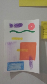
On Tuesday 29th, there was an activity that people were taking part in about waste in the creative industry. The idea was to create a chain of works that each derived from each other. Essentially a visual, creative, Chinese Whispers (or the more PC term as the American’s know it, ‘Telephone’).

20140429_123340

The previous drawing from the line I chose.

20140429_123400

My terrible interpretation!

As usual, I had lots of fun at Pick Me Up and can’t wait to return next year. I’m even looking forward to my next visit to Somerset House as I love it there.

Release The Kraken!

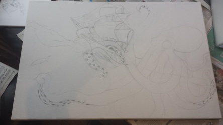
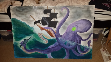
An old school friend and I were recently talking, and the idea of collaborating on a painting together came up. I haven’t painted in an awfully long time due to my focus on graphics, so the prospect of getting messy with some paint was too tempting!

I’ve had a recent fascisnation with Octopuses, so I really liked the idea of a Kraken attacking a ship. This is common imagery for the Kraken as it is part of it’s myth. We completed it over two days, but counted it as about eight to nine hours.

It was really fun getting back into painting, and a new experience being able to share the process with someone, and relying on their opinion when in doubt! We’ve already talked about ideas for another painting!

Here are some photos of the painting in progress.

20140203_145111 20140203_162036 20140203_173540 20140210_152850 20140210_202559

Graphic Design Research Journal

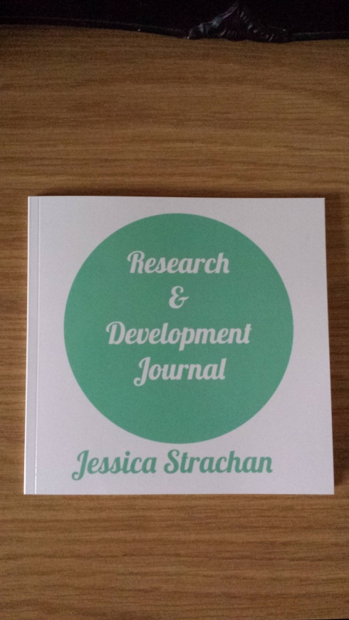
For my first Graphic Design assignment in first semester of year two, I had to research and test various different methods and replicate different types of design and present it in a professionally printed book.

I am currently in the process of creating another one, this time documenting the making of a promotional campaign for Waterstones, the book shop. The aim is to get more people to get reading and appreciate books again.

Here are a few images of my Research Journal. 20140112_114253 20140112_114628

Galadriel

Galadriel

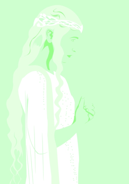
This is a quick illustration I did of Galadriel, an Elf from The Lord of the Rings and The Hobbit. I used pale, mint greens because the Elves are very connected to nature and the earth. She is also very elegant and has very light hair and skin, which is why I kept the colours light and fresh.

Chicago

On the 20th of June, I went to Chicago with some friends. It took a lot of time saving money, but it was well worth it. This was my first holiday abroad without family or school/university.

I much prefer a city break rather than a beach/poolside holiday, as I love soaking up the culture and the atmosphere of somewhere unfamiliar. This holiday provided the perfect opportunity to see amazing architecture and meet very interesting people.

If it wasn’t for the generosity of a very close friend and her extremely generous family, this holiday would never have happened. We experienced so much, had great food, good laughs, and had the chance to experience both the tourist parts of the city, and also the secret parts that only true Chicagoans would know about. I would 100% recommend Chicago to somebody looking for a sight seeing, big city, American holiday, but would prefer something slightly more relaxed than New York City.

Here is a selection of the best pictures taken. Enjoy!

Image

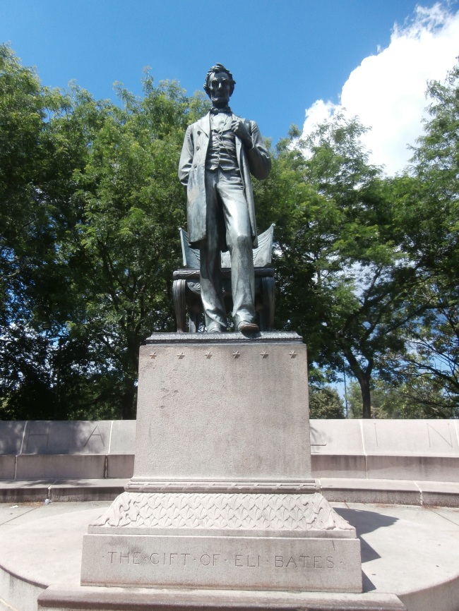
This is the Statue of Abraham Lincoln, in Lincoln Park.

Image

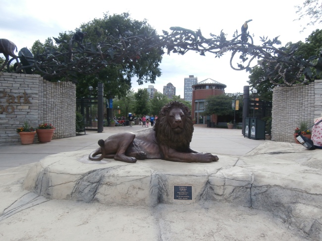
Lincoln Park Zoo

Image

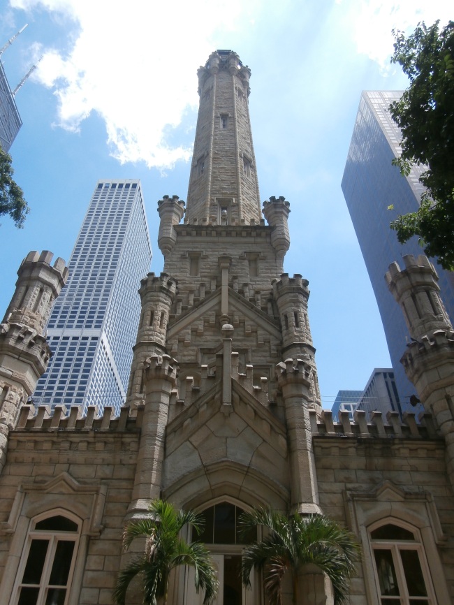
The Water Tower, one of the few buildings that survived the Great Fire of Chicago in 1871.

Image

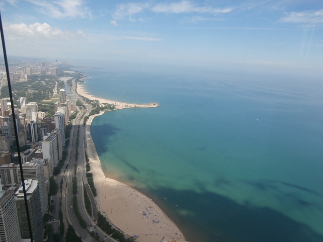
The view of Lake Michigan from the observation floor of the John Hancock building.

Image

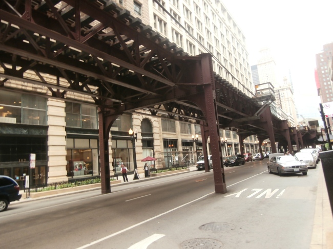
The ‘L’ (elevated train).

Image

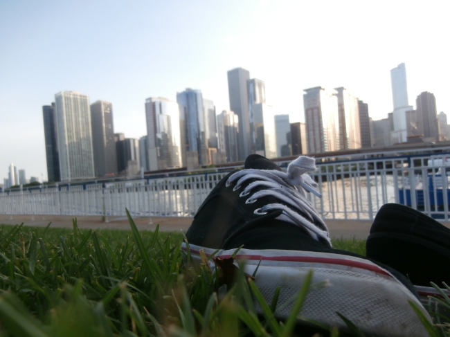
Relaxing whilst in Downtown.

Image

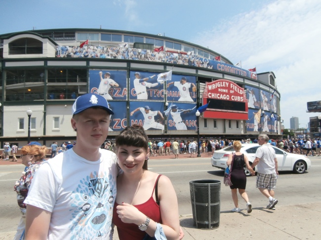
About to watch the Chicago Cubs win at Wrigley Field.

Image

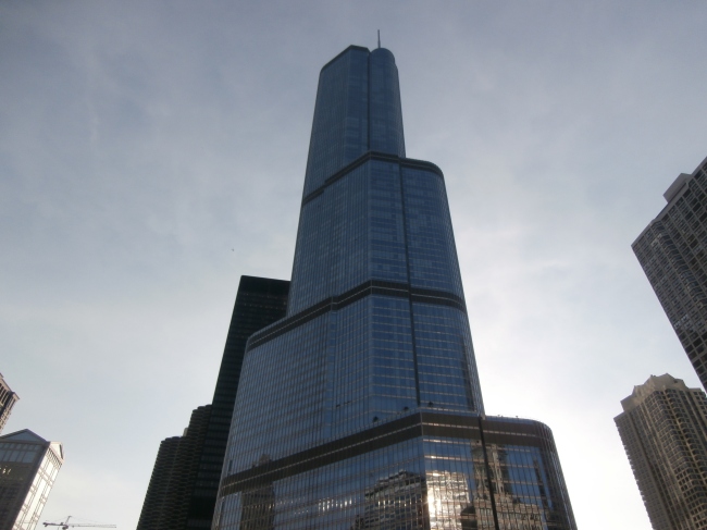
Trump Tower, Downtown.

Image

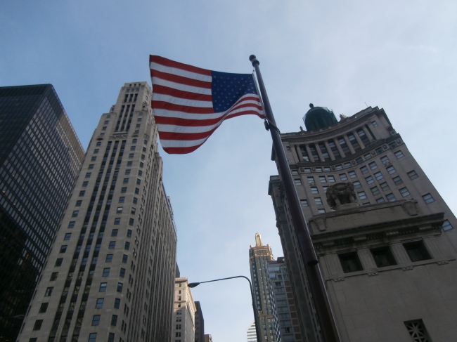
Downtown.

Image

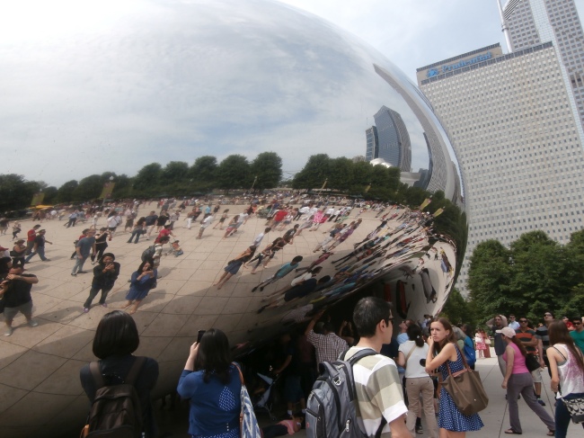
The Bean.

Image

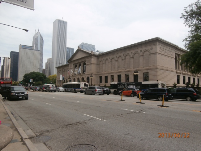
The Art Institute

Image

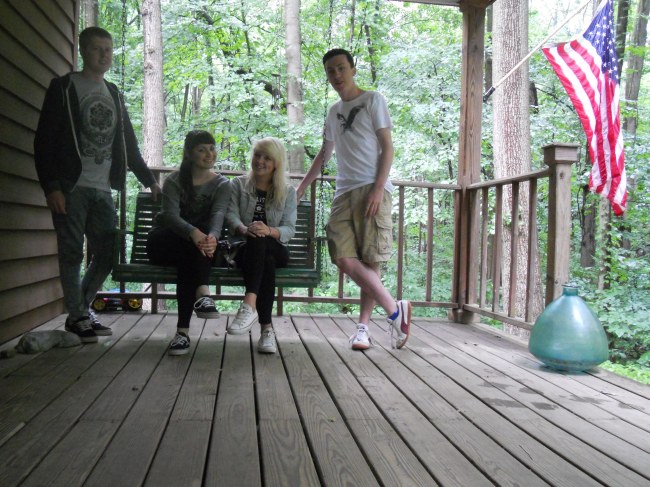
Phil, Me, Laura and Rich.

Image

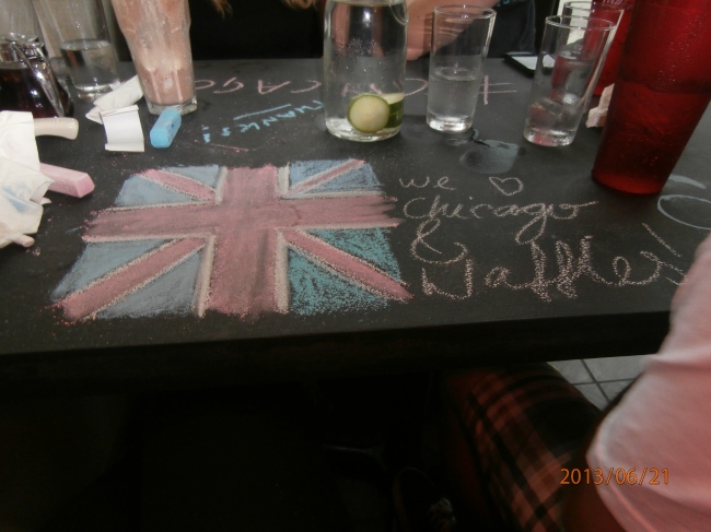
We love Chicago!